
- Custom Silk Scarf
- Custom Tie
- Custom Bow Tie
- Custom Print Fabrics
- Printed Satin Silk Fabric
- Printed Twill Silk Fabric
- Printed Silk Crepe De Chine Fabric
- Printed Silk Georgette Fabric
- Printed Silk Habotai Fabric
- Printed Silk Jacquard Fabric
- Printed Silk Cotton Fabric
- Printed Silk Viscose Fabric
- Printed Silk Linen Fabric
- Printed Silk Tencel Fabric
- Printed Silk Modal Fabric
- Printed Silk Wool Fabric



Good custom silk scarf artwork does more than look attractive on a screen. It gives the production team clear information about scale, color, placement, borders, orientation, and finishing. When those decisions are left open, even a strong design may require extra revisions before sampling.
This guide explains how fashion brands, designers, museums, corporate buyers, and private-label teams can prepare artwork for custom silk scarf printing. It is a practical preflight process rather than a universal factory specification: file requirements, print tolerances, and finishing allowances depend on the selected fabric, scarf size, printing method, and construction. Confirm the final template with your manufacturer before approving production.
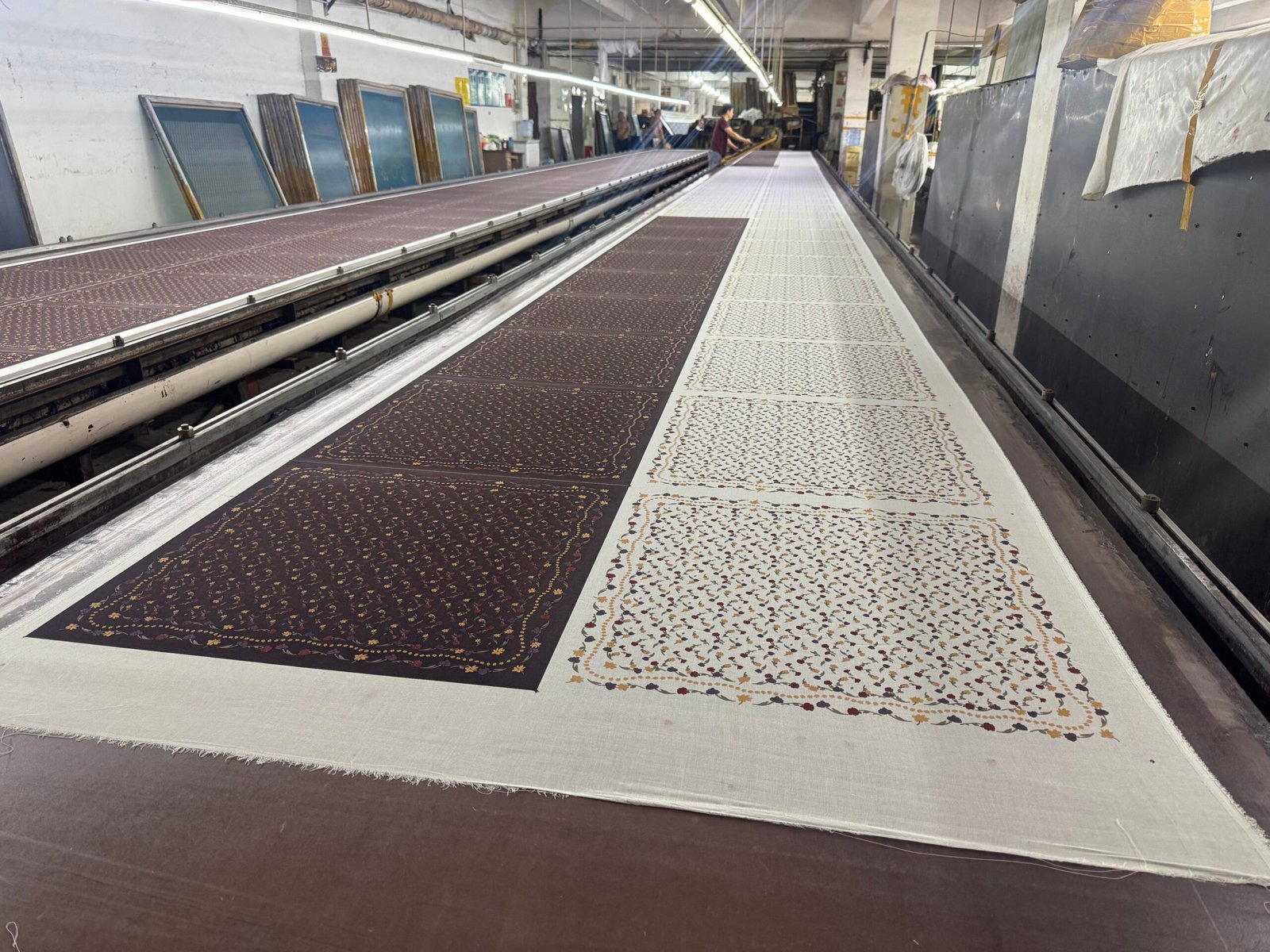
Start With the Finished Scarf Specification
Do not build the design around an arbitrary square and decide the product later. First define the finished scarf size, shape, fabric, print direction, and edge finish. A 55 cm square with a machine hem is not the same artwork problem as a 90 cm square with a hand-rolled edge. A narrow twilly, triangle scarf, or long scarf also changes the useful design area and the way a motif is seen when worn.
Before opening the artwork file, confirm these project details:
- Finished width and height, including the unit of measurement
- Square, long, skinny, diamond, triangle, or another shape
- Selected fabric and fabric weight
- Single-sided, double-sided, or screen-printing direction
- Machine hem, hand-rolled hem, or another edge treatment
- Whether the design is centered, bordered, all-over, or repeating
- Logo, signature, copyright line, label, and packaging requirements
If the product specification is still open, review CarinaSilk’s custom silk scarf manufacturing options before finalizing the artwork.
Choose the Right Artwork Type
Vector artwork for logos, borders, and clean geometry
Vector graphics are built from mathematically defined paths, so their edges remain crisp when the design is enlarged or reduced. They are usually the safer starting point for logos, typography, fine border systems, icons, and geometric patterns. Adobe’s explanation of raster and vector graphics shows why vector elements scale more reliably than pixel-based artwork.
Keep an editable master file. Convert fonts to outlines only in the production copy, and retain a separate editable version in case spelling, sizing, or legal text needs to change. Check thin lines at the final scarf scale; a line that looks substantial while zoomed in may become visually weak on fabric.
Raster artwork for paintings, photographs, and textured illustrations
Raster artwork is made from pixels. It can reproduce watercolor, photography, grain, brush texture, and complex tonal detail, but it loses clarity when enlarged beyond the available pixel information. Build or scan raster artwork at the intended physical print size whenever possible.
Adobe identifies 300 pixels per inch as a common standard for high-quality print images. Treat that as a useful starting reference, not an automatic factory rule. Ask the production team to confirm the required resolution at final size because the fabric, printing process, RIP workflow, and visual style can affect what is practical.
Artwork Preflight Table
| Item | What to prepare | Why it matters |
|---|---|---|
| Document size | Artboard matches the confirmed finished scarf dimensions | Prevents accidental scaling and motif distortion |
| Editable master | Original layered or vector file plus a review PDF | Makes corrections and production review easier |
| Raster resolution | High-resolution images evaluated at final print size | Reduces pixelation and loss of detail |
| Color references | Named brand colors and relevant physical references where available | Creates a clearer target for sampling |
| Fonts and links | Fonts outlined in the production copy; linked images included or embedded | Avoids missing assets and font substitution |
| Edges | Background and border account for the confirmed cutting and hemming allowance | Protects important artwork near the finished edge |
| Orientation | Top, bottom, front, reverse, and label position clearly marked | Prevents rotation or side-placement errors |
| Approval view | Low-resolution PDF or JPG showing the intended final appearance | Gives the factory a simple visual reference |
Set Up Borders, Bleed, and the Safe Area
In general print production, bleed means extending the design beyond the trim boundary so small cutting differences do not create an unintended unprinted edge. Adobe’s bleed guidance explains this principle. A scarf needs its own manufacturer-approved allowance because fabric can be printed, cut, sewn, and rolled differently from paper.
Ask for the exact template instead of assuming a universal bleed number. Extend full-coverage backgrounds beyond the finished boundary according to that template. Keep logos, signatures, text, faces, and other critical details inside a safe area. For bordered scarves, check all four sides numerically rather than relying only on visual centering.
Edge finishing also changes what remains visible. A hand-rolled edge can visually consume part of a border, while a machine hem creates a different finished line. The design file should reflect the agreed construction, not just the unsewn printed panel.
Plan Color for Fabric, Not Only for a Monitor
Color on a backlit display is not a physical production standard. Screen calibration, color profile, silk weave, surface luster, fabric weight, dye or ink behavior, finishing, and lighting can all influence the final appearance.
Pantone explains that its graphics and Fashion, Home + Interiors systems serve different materials and applications, and that color appearance can change with the substrate. For important brand colors, identify the exact reference system and code instead of writing only “navy,” “beige,” or a hexadecimal value. If you have a physical reference, discuss how it should be used during sampling.
Do not convert every file to a new color mode immediately before delivery. Ask which color profile and export settings the printer wants, then supply the editable master and a visual reference. The printed sample remains the most useful decision point for evaluating color on the selected silk.
Prepare Repeats, Borders, and Double-Sided Designs
Repeating patterns
For an all-over repeat, identify the repeat tile and test every seam. Look for broken lines, obvious gaps, doubled motifs, and unwanted bands. Include a larger preview showing several repeats so the production team can understand the intended rhythm, scale, and direction.
Bordered scarves
State the border width and its relationship to the finished edge. If corners contain special motifs, check that all four corner relationships are deliberate. Confirm whether the border should remain visually equal after hemming or whether the artwork is intentionally asymmetric.
Double-sided artwork
Name the files clearly as Side A and Side B. Mark the top edge and describe whether the reverse should mirror, rotate, align with, or differ from the front. Place a small orientation diagram in the approval PDF. Ask the manufacturer to review registration expectations before sampling, especially when narrow borders or precisely aligned features appear on both sides.
Add Labels and Brand Details Without Damaging the Composition
A printed logo inside the artwork, a sewn brand label, and a care label are different production elements. Show the requested position for each one. Keep legal or care information editable until the fiber content, country-of-origin wording, and destination-market requirements have been confirmed by the appropriate parties.
For a private-label project, include a simple specification page listing the logo treatment, label dimensions, placement, thread or print color, hangtag, packaging, barcode, and any insert card. These details should be reviewed alongside the scarf rather than after the print sample is approved.
Use Sampling as a Production Decision
A digital mockup checks layout, but it cannot fully show drape, luster, fabric texture, print penetration, edge finish, or how colors react on the chosen material. Review the sample as a product, not only as an image.
During sample approval, check:
- Finished dimensions and shape
- Motif scale and placement
- Color under consistent viewing conditions
- Fine-line and small-text legibility
- Border balance after finishing
- Front and reverse orientation
- Label position and stitching
- Packaging fit and presentation
Record approved changes in one consolidated revision document. Avoid sending conflicting corrections across several email threads. CarinaSilk’s custom order process can help buyers organize specifications before sampling. Fabric is also part of the artwork decision; compare the practical differences in the silk twill versus silk satin buyer’s guide.
Final Artwork Delivery Checklist
- Use a descriptive project name and version number.
- Match the artboard to the confirmed scarf size and shape.
- Include the editable master file and a review PDF.
- Package linked images and confirm fonts are handled correctly.
- Check raster resolution at final print size.
- List important color references and the reference system used.
- Mark bleed, safe area, border width, and finishing allowance according to the supplier template.
- Label front, reverse, top edge, and orientation.
- Show logo, label, and packaging placement.
- Include a written specification and target delivery context.
Frequently Asked Questions
What file format should I send for custom silk scarf printing?
Send the editable master file together with a simple review PDF, then confirm the manufacturer’s preferred production format. CarinaSilk can review common design and print files, but the best handoff depends on whether the artwork is vector, raster, repeating, bordered, or double-sided.
Is 300 ppi always required?
Adobe describes 300 ppi as a common standard for high-quality print images, but the correct requirement should be confirmed at the final physical size with the production team. Vector elements are resolution-independent; raster artwork must contain enough pixels for its intended scale.
Should I use RGB, CMYK, or Pantone colors?
Keep the editable master and ask the printer which profile and reference system it wants. Pantone references can make an important color target clearer, but the selected silk and production process still affect appearance. Approve critical colors on a physical sample.
How much bleed should a silk scarf design include?
There is no universal number for every scarf project. Cutting, hemming, fabric, size, and print method affect the allowance. Request the project template and keep critical artwork inside the stated safe area.
Do I need a sample if the artwork PDF looks correct?
A PDF can confirm layout and content, but it cannot fully predict color, hand feel, drape, print behavior, or the finished edge. A physical sample is the appropriate stage for approving those product-specific details before bulk production.
Ready for an Artwork and Sampling Review?
Send your scarf size, shape, fabric preference, quantity, artwork file, color references, printing direction, edge finish, label requirements, packaging idea, destination country, and target timing. CarinaSilk can review the specification and identify the points that should be confirmed before sampling. Request a custom silk scarf artwork review and quotation.